Tuesday, November 30, 2010

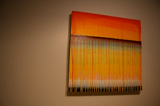
tormenta hermosa - 2010


Took a while, but I finally completed this piece a few weeks ago. Seeing the painting live is so much more vivid as some of the interesting colour interactions are lost with the photo. None-the-less, here it is. A continuation of the drip, blend and splatter process, I hoped with "tormenta" to really embrace the long drips by creating predominantly vertical canvases. Breaking it into a tryptic, I felt, also emphasized the vertical and created more visual interest in the piece.

tormenta hermosa is acrylic on canvas, Tryptic, 11.75 x 48in (x3)
Friday, October 15, 2010

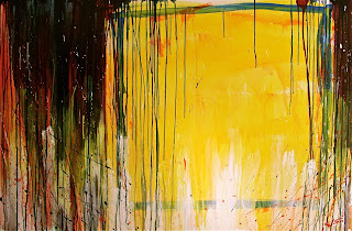
abrir fuego - 2010


This painting, roughly translated as "open fire", snuck up on me. Originally my mind's vision of the end image was something altogether different but as I applied the paint it became more and more disappointing. It was not until I scrapped the original direction and started to react to each layer applied that this image eventually became manifest followed by that ever fleeting sense of satisfaction.

abrir fuego is acrylic on canvas and is 39in H x 59in W.

Sunday, October 10, 2010

Horizon Study 1


Though this was made a year or more later, I do attribute the blending Horizon Study 1 to the 5 Colour Study. The layering of colours stuck in my mind and I took it another step with this piece. I was creating 4 paintings at once with Horizon Study 1 and Clash being two of the pieces. The other two got picked up in a silent auction though I, in my nativity, never got the buyers names or documented them... brilliant I know. Perhaps, God willing, they will resurface in the future. As you can see the drips on the side are prevalent and as usual are generating as much intrigue in the process as with the image and composition itself.

Horizon Study 1 is 24in H x 48in W and is acrylic on canvas. And I still have this one :)


5 Colour Study (YORGB) - 2003/2004


This painting was created around the same time as RYGB. Again taking a simple approach and basically layering one colour over another. Orientation of this piece is debatable but I typically like to hang it horizontally but it does have an appeal with a vertical viewing as well:


Thankfully, I still have this piece. Nothing racks my brain more than losing track of works. The retro 60's/ 70's colour bands couldn't be avoided. Looking past that I really enjoyed how there seems to be a subtle drawing into the centre and sense of depth and motion as a result.

5 Colour Study (YORGB) is acrylic on canvas and is 24in x 30in.

4 Colour Study (RGYB) - 2003/2004


Hello.. I bet you thought I fell off the map. Kind of did. Life took hold of the wheel for a while there. Anyway, thought I would continue where I left off with posting some of my older works. This 4 Colour Study I created approximately 6 or 7 years ago while studying at Emily Carr. It follows the themes of simplicity and colour composition. I was well into the Communist Manifesto which might explain the red but I was also attempting Mein Kampf which for some reason I failed to get through. Very interested in how basic colour combinations can illicit certain responses in the viewer. Propaganda at it's best.

MIA alert! This piece I have lost track of in one of my many moves since 2003 so unfortunately I don't have it and can't recall if I released it to someone or just plain lost it. Sad because I really liked it.. :(

RGYB was acrylic on canvas and was 18in x 18in

Tuesday, September 7, 2010

3 colour study (wob) 2002


I really need to track this back accurately but I want to put the creation of this painting to 2001 or 2002. It, too, was made during my initial exploration of colour and composition. Very, very simple. Playing with how solid colours interrupting a viewing space and creating a base response in the viewer. I really wanted to explore basic colours like orange, blue, or white. I've always liked white. It's connotation of purity and innocence. Something lost and never recovered...

This painting was another weighty piece. Acrylic on MDF- 49inH x 30inW

Sunday, September 5, 2010

composition2

composition2 was a study created during the period 2001/ 2002. It was another lesson in preplanning size and material as it is four 48in x 48in paintings on thick MDF board. In other words: LARGE AND HEAVY! That aside I love the piece. It was pue experiment and exploration in colour and composition. The graphic qualities of the piece lends itself to the body of work I have created over the years that speak to commercial aesthetics. This also is another prime example of a piece that has multiple viewing capabilities for the viewer with the versatility of rotating four paintings. Another painting that influenced future studies in this vein of my artistic exploration.


composition2 is also done in acrylic medium. It also sits in my home given its size and need for substantial wall space. I really need to put a show together... (note to self)


Saturday, September 4, 2010

neonewmanism 1 - 2002


This painting is a jewel. A diamond in the rough so to speak. Initially when I was studying at Emily Carr, I had aspirations to animate or illustrate. Painting was not really something I thought to seriously explore. This painting shifted my process significantly. Since I was enrolled in painting, I took the medium and decided to play with it. I loved simplicity and wanted to see what I could do with a large colour field and obstruct it with minor interruptions within the composition. This was the end result. I was quite pleased with it. It led to many other paintings and studies and probably can be attributed to my enjoyment of painting today. It wasn't until after it's creation that I was pointed to Barnett Newman. The American abstract painter of the mid 20th century. I embraced this resemblance to his paintings, hence the title.

Neonewmanism 1 is 49in H x 30in W. It is acrylic on MDF.

Thursday, August 26, 2010

evanesce 1 - 2010


Bam! Felt like the tethers were cut on this one. The name is somewhat of a dichotomy of the image since it is frozen in time and tangible but the essence I hope is what is being captured. This was an approach atypical of my usual but definitely emancipating as, prior to this, I felt I was painting myself into a corner... eww. Horrible pun. None the less, I found it very exciting and has lent itself as a rejuvenated springboard for further exploration of expression.

I apologize for the glare.

Evanesce 1 is acrylic on canvas and is 24in H x 24in W in dimension

horizon study 2 - 2008

This next painting was completed approximately 2 years ago. I was in the middle of some fairly stressful life events yet I was able to take the time to paint this image to help stay grounded. It encapsulates some of the techniques that signify my style at the time: primarily the gradations and the solidified drips along the side of the canvas revealing the process of production. Interestingly enough, the drips often generate more conversation than the actual composition. Over time I had learned to embrace this as a larger commentary on "process versus product" or "journey versus destination".

horizon study 2 - 2008 - acrylic on canvas
36in H x 18in W


horizon study 2 - 2008 (detail)

This painting now resides in my cousin's abode.


Monday, August 23, 2010

Propaganda Study IV 2004


Now we're cooking. This one is a gooder. It still hangs in my hall though I have to hang it sideways due to the 7 foot height. I made two other works with the same dimension. It was a true lesson in planning canvas sizes for the future.

It is called "Propaganda Study IV" and I was deep into my historical readings of Marx and Hitler. I read the Communist Manifesto during this time and merged into Mein Kampf though I never did finish the latter. What really stuck with me was how "simplicity reaches many, while complexity reaches mini". The title of the piece is the true meaning in the message ;) This work was also included in my grad exhibit catalogue from Emily Carr in 2006.

This piece is acrylic on canvas and is 84"h x 24"w in dimension.

Clash 2005


Now that I am in painting mode, I thought I would post some past works to reflect a bit.

This painting, "Clash" was produced in 2005 as a tie-in project for a theatre production. It was 1 of 4 paintings made for the project. Two of the paintings were purchased while I was able to keep this painting as well as another. Though the painting was supposed to relate to the plays being produced, it was a bit of a reach. My true intention was to extend the practice of the style I was exploring at the time which was namely taped hard edge lines in a series that could evoke a sensual response from the viewer through aesthetics. The title simply refers to the clash of the warm and cool colours.

I have since parted with this painting but I do know it was acrylic on canvas and approximately 24"x 48" in dimension.

Tuesday, August 10, 2010

splatr study 1 2010 (Tharemustbyareesun)

It been approximately 2 years since I produced a painting. Check that. Completed a painting. My brother has been hounding me for a painting I started a year ago which continues to collect dust on my fireplace stoop. Anyway, this piece I am currently calling "Splatr Study 1" or "Tharemustbyareesun". I can go into the psychological underpinnings of this piece but right now I am feeling particularly vulnerable so I will sit on it. I can also go into why I choose to alter spelling in my titles as a reflection of the bastardized English of the texting era or the amalgamation of misspelled English words to look like an interesting foreign or ancient tongue, but maybe that was alreddherekon hysd. As with past pieces, the orientation of the painting is up to the viewer hence why I am posting it x 4.


I, of course, have a preferred way to hang this piece, but again, it can shift with my mood. So the viewer, too, has this liberty. I initially started this painting as a revisiting of previous techniques but found I was not satisfied with going through the motions. Hence "the splatrs". Now I think I know how Pollock felt. Very exonerating. There is something freeing about throwing paint and letting chance take it's course. There is simple symbolism reflecting personal conversations with self but again it can be a trap to the greater ability of the viewer being able to personalize the piece via his or her own views without getting too entangled in my own interpretation. I hope you like it.


Splatr Study 1 is 61x61 cm or 24x24 in. It is acrylic on canvas and, for those interested, is FOR SALE! Anyone interested in picking up this piece, let me know. I'm asking $650. Cheers for now.

David (p1)


This image I took recently while my Boxer David was curled up in my tent late one night on my aforementioned camping trip. The lighting was great and I took several shots. This image I chose because of both the contrast of light and dark within the wrinkled lines of David's face and limbs but also because of his massive presence within the composition. I later created the painterly effect simply by using one of the filter tools on photoshop... Why paint when the computer will do it for you?


Sunday, August 8, 2010

I feel this poem is in process and I wrote it last night while painting in my shed. It has been ruminating in my head since a recent camping trip I just finished. It's not complete but as usual I like to put things out in the raw, premature to the pinnacle. To me, it speaks to the general need to explain the unknown. To put a finger on something that is omnipresent and omnipotent. To put a finger on God. There is such a divergence from conventional religions now, that perhaps because of the dilution so to speak, mythologies, superstitions and pagan ritual have a resurgence. Regardless there is a security in a figure that will always be there. Unwavering. Unmoving. Unchanging. Watching the chaos below. The significance of the fist sketch? Well, I'll leave that up to your imagination...

Sunday, August 1, 2010

timetotell some1


Okay. So today I just really wanted to follow up with another post. Nothing spectacular. Just another post. I took a drawing I sketched this evening and applied some rough thought that I felt spoke to my own yearnings to connect with others and let "it" out. Without judgement and without drama. Just to share experiences. You know. That's when a connection is felt. I'm also noticing a shift in my typical as of late robot sketches. This particular one has a humanizing quality to it. Perhaps a divergence from mechanical to maniacal?

black dog eats


I thought I would try something new. Including thoughts of the blog entry as I post. My entries have been intermittent and seldom. Attributed to many of life's curves and trials. Not complaining. That would be counterproductive. Just saying. It is now 1:07 am and I wanted to go to bed an hour and a half ago. But that small voice deep inside. That voice that has become buried and barely audible. I heard it. My head and my heart and then my hands. The poem itself was composed during the last day of July 2010. The first stanza was compiled or written while driving into downtown Vancouver to pick up my son. The second and third stanzas came to me outside the gym in the evening. The photo was picked out a bunch of half staged half found compositions as I set my camera up while I carried through with various activities in the evening. I thought I would overlay thoughts and actions. If there is a correlation or something indecipherable. In the end, its really all just self wrestling self. Or dog fighting dog. And in this case black dog eats, black dog wins.

Tuesday, May 25, 2010

A Scout in the Curtains

Always curious. I was able
to capture David on the
lookout only to meet his
match. At least in the
visual sense.

Monday, May 24, 2010

Sunday, May 23, 2010

Tuesday, May 18, 2010

Sunday, May 16, 2010

Sunday, May 2, 2010

Sunday, April 18, 2010

Monday, February 1, 2010

Saturday, January 23, 2010