Friday, October 15, 2010

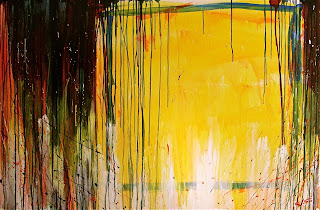
abrir fuego - 2010


This painting, roughly translated as "open fire", snuck up on me. Originally my mind's vision of the end image was something altogether different but as I applied the paint it became more and more disappointing. It was not until I scrapped the original direction and started to react to each layer applied that this image eventually became manifest followed by that ever fleeting sense of satisfaction.

abrir fuego is acrylic on canvas and is 39in H x 59in W.

Sunday, October 10, 2010

Horizon Study 1


Though this was made a year or more later, I do attribute the blending Horizon Study 1 to the 5 Colour Study. The layering of colours stuck in my mind and I took it another step with this piece. I was creating 4 paintings at once with Horizon Study 1 and Clash being two of the pieces. The other two got picked up in a silent auction though I, in my nativity, never got the buyers names or documented them... brilliant I know. Perhaps, God willing, they will resurface in the future. As you can see the drips on the side are prevalent and as usual are generating as much intrigue in the process as with the image and composition itself.

Horizon Study 1 is 24in H x 48in W and is acrylic on canvas. And I still have this one :)


5 Colour Study (YORGB) - 2003/2004


This painting was created around the same time as RYGB. Again taking a simple approach and basically layering one colour over another. Orientation of this piece is debatable but I typically like to hang it horizontally but it does have an appeal with a vertical viewing as well:


Thankfully, I still have this piece. Nothing racks my brain more than losing track of works. The retro 60's/ 70's colour bands couldn't be avoided. Looking past that I really enjoyed how there seems to be a subtle drawing into the centre and sense of depth and motion as a result.

5 Colour Study (YORGB) is acrylic on canvas and is 24in x 30in.

4 Colour Study (RGYB) - 2003/2004


Hello.. I bet you thought I fell off the map. Kind of did. Life took hold of the wheel for a while there. Anyway, thought I would continue where I left off with posting some of my older works. This 4 Colour Study I created approximately 6 or 7 years ago while studying at Emily Carr. It follows the themes of simplicity and colour composition. I was well into the Communist Manifesto which might explain the red but I was also attempting Mein Kampf which for some reason I failed to get through. Very interested in how basic colour combinations can illicit certain responses in the viewer. Propaganda at it's best.

MIA alert! This piece I have lost track of in one of my many moves since 2003 so unfortunately I don't have it and can't recall if I released it to someone or just plain lost it. Sad because I really liked it.. :(

RGYB was acrylic on canvas and was 18in x 18in